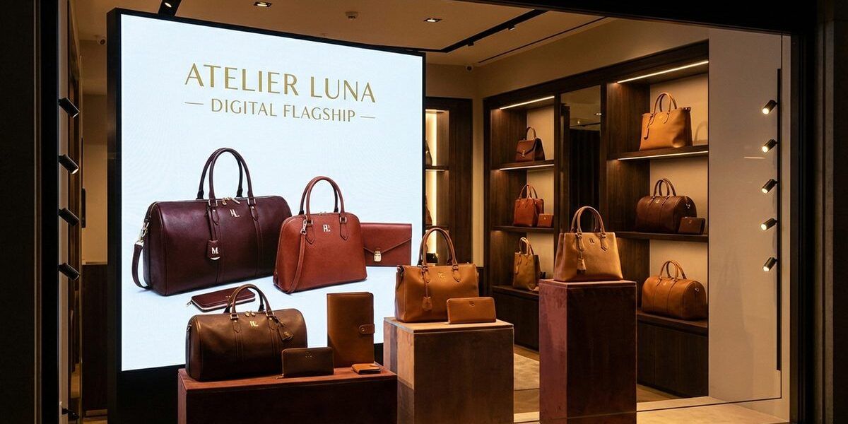
Inside Mulberry’s Digital Flagship Experience
Luxury brands face a unique digital challenge: how do you translate the experience of a beautifully designed store — the materials, the lighting, the sense of occasion — into pixels on a screen? Mulberry’s digital flagship tackled this question directly.
The Luxury Digital Gap
Most luxury e-commerce sites fell into one of two traps. Either they prioritised brand storytelling at the expense of usability, or they optimised for conversion and lost the sense of luxury. Mulberry wanted both — an experience that felt premium and actually worked.
Design Philosophy
The design took its cues from Mulberry’s Somerset roots — the craftsmanship, the materials, the English countryside aesthetic. Full-bleed imagery showed products in context rather than on white backgrounds. The colour palette drew from Mulberry’s physical stores — rich greens, warm leathers, brushed metals.
Navigation was simplified. Luxury shoppers don’t want to work hard to find what they’re looking for. The information architecture prioritised browsing pleasure over catalogue efficiency, with editorial content woven throughout the shopping experience.
Craftsmanship in Code
Every interaction was polished. Page transitions were smooth and deliberate. Hover states revealed product details elegantly. The basket experience felt like gift wrapping rather than a checkout process. These details are invisible when done well — but their absence is immediately felt.
Results
The redesigned digital experience delivered improved conversion rates alongside higher average order values. But the metric Mulberry valued most was customer feedback — the platform finally felt like a genuine extension of the brand.
Related
Mulberry’s digital flagship is a strong example of how brands use interactive experiences. For more luxury brand digital work, see our coverage of luxury digital at Social Media Week.